Swiss CV layout and length — pages, columns, typeface
Updated:
The three questions about form that come before any question about content: how long, how arranged, how set. Only one of them has an official Swiss answer — the federal application-tips page names a page limit, and names the same one in all four of its language versions. The market figures on this page are counted from the adverts on SwissJobs.app.
- How many pages should a Swiss CV be?
- Which font should I use on a Swiss CV?
- One column or two on a Swiss CV?
How many pages should a Swiss CV be?
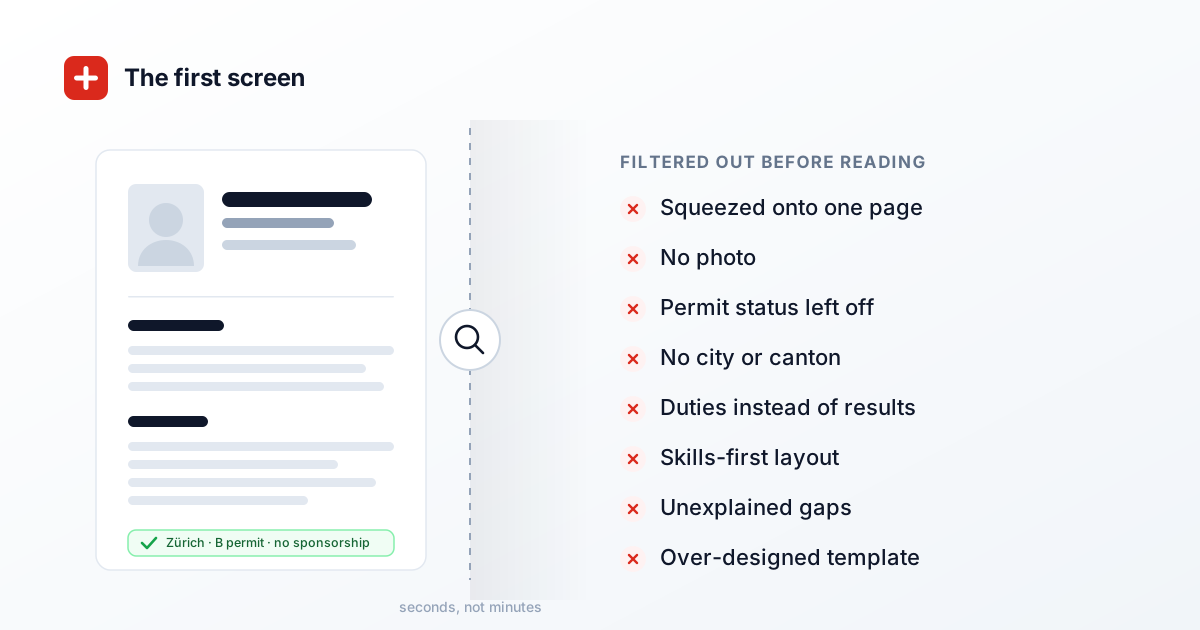
In short
Two pages for most applicants, three as the ceiling, and one page is too few in Switzerland. The federal application-tips page states it plainly: a CV should be no longer than three pages. The same page requires it to be complete, clear and free of gaps, and lists eight blocks it should contain. One page can only hold that if something has been dropped — and what was dropped is exactly what a Swiss reader looks for. The third page is a reserve, not a target.
This is the opposite of the advice most international candidates arrive with. A US résumé is one page because there is nothing behind it: no reference letters, no certificates, nothing an employer will read after the first document. A Swiss application works the other way round. Every position you have held comes with an Arbeitszeugnis — a written reference from that employer — and those are submitted alongside the CV, gapless and in reverse chronological order, in their own PDF. The CV is the map to that evidence. A map that skips regions is not shorter; it is wrong.
How much history you actually have to map is measurable. Among the adverts on SwissJobs.app that name a number of years of experience, 24.7 per cent ask for three years or fewer and 45.6 per cent ask for four or five. Only 14.1 per cent reach ten years or more, and the median demand is five years. Roughly seven in ten stated requirements therefore stop within five years of today. Anything older than that is context rather than qualification — which is precisely the material that belongs in a compressed line rather than a full block.
- The number comes from an official page, not a template vendor. arbeit.swiss is run by the State Secretariat for Economic Affairs and is the source almost every Swiss application guide traces back to. Its CV section reads: «It should: be complete, clear and not contain any gaps. A CV should be no longer than three pages.» There is no more authoritative Swiss statement on the question than that sentence.
- Three is a ceiling, not a target. The phrasing is «no longer than» — it tells you where to stop, not where to aim. Filling a third page with courses from a decade ago that no advert asked for does not satisfy the guidance; it just spends the allowance. If two pages carry everything, two pages is the correct answer and you have lost nothing.
- One page fails on the content list, not on taste. The same official page names eight components: the title «CV», personal details including a photograph, professional experience to date, education and training, language skills, special knowledge or activities, personal interests or hobbies, and references. Fitting eight blocks and a decade of employment onto one page means either deleting roles or shrinking the type. Both are visible.
- You cannot shorten a Swiss CV by deleting years. The English text is unusually direct about this — the CV must «not contain any gaps». Shortening here means summarising, not omitting: two early jobs become two lines carrying year, title and employer. Delete them and the reference letters attached to the same application will show the missing period anyway.
- Your reference letters do not consume CV pages. arbeit.swiss asks for work references, diplomas and certificates gathered in a separate PDF, gapless and chronological with the most recent first. That separation is why a Swiss CV can be both complete and short: the proof lives elsewhere. Copying duty lists out of an Arbeitszeugnis into the CV duplicates the dossier and adds nothing, because the letter is the evidenced version.
- References cost you one line, not a block. The official page says the CV normally notes that references are available on request, and that a separate sheet of referees can be handed over at the interview. A full referee list with names, roles, addresses and phone numbers eats a third of a page for information nobody has asked for yet.
- The third page tracks seniority, not age. Among the adverts on SwissJobs.app asking for three years or fewer, only 13.7 per cent carry a seniority word — senior, lead, head of, principal, director, or their German, French and Italian equivalents — in the job title. Among those asking ten years or more, 63.6 per cent do. Across the whole set of adverts the figure is 13.3 per cent.
How long a Swiss CV may be
| Situation | Pages | Why |
|---|---|---|
| Entry level, under 3 years | 1–2 | complete is better than padded |
| The normal case | 2 | what Swiss HR expects |
| From roughly 10 years | 2–3 | shorten older roles, do not delete them |
| Leadership or specialist track | 3 | projects and scope need room |
| Academic with publications | 3+ with an annex | publication list kept separate |
| One page | rarely right | it cuts exactly the detail that gets checked |
The one-page rule comes from the US and does not apply here: Swiss recruiters expect evidence, and a CV squeezed onto one page reads as a thin career. Two pages is the norm.
What the official page actually says
Search this question in English and you get advice written for London, New York and Berlin, applied to Switzerland by assumption. There is, however, a Swiss source that states a number, and it is a federal one: the application tips published by arbeit.swiss, the portal of the State Secretariat for Economic Affairs. Under the heading for the CV it says the document is the important part of your application, that it should be complete, clear and contain no gaps, and that it should be no longer than three pages.
What makes that sentence useful is how rare it is. Almost nothing else about the form of a Swiss application is officially quantified. There is no published rule on typeface, none on column count, none on the dimensions of the photograph. Page count is the single measurement the authority commits to — and it commits to three, not to two, and certainly not to one.
The second official channel, berufsberatung.ch, the career-guidance portal run by the cantons, lists the three components of an application dossier for working adults — cover or motivation letter, CV, work references and qualifications — but gives no page count at all. So the number three is not a consensus repeated across Swiss officialdom. It exists in exactly one place, which is a good reason to quote that place accurately instead of paraphrasing it from memory.
The same page, four languages, two degrees of obligation
The page exists in German, French, Italian and English, and the number is identical in all four. The verb is not. German says the CV «sollte» not exceed three pages and English says it «should» be no longer than three — both recommendations. French says «ne doit pas dépasser trois pages» and Italian «non deve superare le tre pagine» — both prohibitions.
That matters if you are applying across the language border. In Geneva, Lausanne or Lugano, a fourth page breaks the version of the guidance your reader was raised on. In Zurich or Bern it departs from a strong recommendation. Nowhere in the four versions is three presented as a soft benchmark you may round upward.
There is a second split worth knowing. English, French and Italian all demand gaplessness inside the CV paragraph itself — «not contain any gaps», «Évitez les lacunes dans votre parcours», «senza lacune nella cronologia». The German version asks only for completeness and clarity there, and mentions gaplessness later, in the paragraph about reference letters. If you are applying in English or French you are therefore being told, in the same breath, to account for every year and to stay inside three pages. That tension is the whole difficulty of this question, and it has one resolution: compress, never omit.
Why the one-page résumé works against you here
The one-page rule is a US artefact with a sound rationale in its home market. American hiring runs without written employer references; the résumé is the only document, so it has to sell. Recruiters screen hundreds of them, and brevity is read as respect for their time. None of those conditions holds in Switzerland.
Here, the shortlist decision is made on a dossier: CV, reference letters, diplomas. The CV's job is to index the rest of it, and every position it names has a corresponding letter behind it. So when a Swiss reader sees a career of ten years fitted onto a single page, the reaction is not admiration for the editing. It is the question of what was cut, and that question gets asked before anything about your fit for the role.
The mirror-image mistake costs just as much. Five pages, because every project got its own paragraph, breaks the only officially published measurement that exists for this document — and breaks it visibly, since the page count shows in the PDF viewer before anyone reads a word. Between «too thin for the dossier behind it» and «over the published limit» there is a narrow band, and for most careers that band is two pages.
Whether you have earned the third page
You can settle this against the adverts you are actually applying to. Among the adverts on SwissJobs.app whose summary names a number of years of experience, the median demand is five years. 24.7 per cent ask for three or fewer, 45.6 per cent for four or five, 15.6 per cent for six to nine, and 14.1 per cent for ten or more. Around seven in ten stated requirements do not reach beyond five years.
Those bands are not spread evenly across levels. In the band asking three years or fewer, a seniority word appears in the job title 13.7 per cent of the time. In the six-to-nine band it appears 59.9 per cent of the time, and from ten years upward, 63.6 per cent. For comparison, across every advert in the set, 13.3 per cent of titles carry such a word. The long requirement and the senior title travel together.
That gives a usable rule. If the adverts in your field typically ask for three to five years, everything older than five years is background: it belongs in a compressed line with dates, title and employer, not in a described block with bullet points. If your adverts ask for ten or more and carry leadership words in the title, you have positions that genuinely need describing one by one — and the third page is earned rather than filled.
What eats pages without proving anything
The usual cause of an unnecessary third page is not a long career but duplicated information. Duty lists lifted from an Arbeitszeugnis appear twice in the same dossier: once in the CV and once in the letter that is attached anyway. Since the letter is the evidenced version, the repetition buys the CV nothing while costing it a third of a page per role.
Blocks that carry no statement are similarly expensive. A referee table with names, functions, addresses and phone numbers fills a third of a page, even though the official guidance explicitly prefers the note «available on request» plus a separate sheet at interview. A skills matrix with rating bars says less than one line of language levels. A cover page costs an entire page and replaces no content at all.
One block that rarely takes too much room is the one that decides most Swiss shortlists. Among the adverts on SwissJobs.app, 15.2 per cent require two languages and a further 4.9 per cent require three or more — for one advert in five, multilingualism is a hard condition rather than a nice-to-have. Stated properly, with a level per language, that block takes four or five lines. It is the best trade of space this document offers.
It is also worth knowing which language your reader is reading in. Of the adverts on SwissJobs.app whose language could be identified, 56.1 per cent are in German, 27.2 per cent in English, 13.1 per cent in French and 2.2 per cent in Italian. An English-language advert is common enough that applying in English is normal — but the conventions on the other end are still Swiss, and the page limit is one of them.
The rule in three sentences
First: aim for two pages, treat three as the limit, and stop using one page as soon as you have more than two or three years behind you. Second: shorten by summarising, never by deleting — the chronology has to hold, because the reference letters behind it will show any year you skip. Third: the third page belongs to positions that answer something the advert actually asked for, and to nothing else.
If you are unsure whether your third page has been earned, delete it and read the document again. If something the advert explicitly asked about has now gone missing, put it back. If what went missing was only completeness for its own sake, it was padding. The test takes five minutes and is more reliable than any guidance written without knowledge of your field.
One reassurance to close on. Page count does not decide an application by itself. It is simply the first thing that registers, because it is visible before anyone reads. That is exactly why it is worth getting right: not because two pages persuade anyone, but because one page or five will have distracted them first.
What people report
Among the Swiss CV posts collected for the SwissJobs.app CV guide, eight state a length. Not one of them sets the ceiling above three pages. Five describe the same pattern — two pages as the norm, three acceptable for senior profiles. The remaining two say one to two pages, and both are written for people relocating to Switzerland from abroad. Practitioner opinion is noticeably tighter than the spread of advice found online.
A count of the Swiss CV posts gathered for the SwissJobs.app CV guide; the ones stating a length were read by hand and assigned to categories.
In the same collection, the one-page CV appears twice as an explicit mistake, both times from people who moved to Switzerland from an English-speaking market and initially kept using their existing document. The description is the same in both cases: on a single page a career reads as thin, and the material cut to make it fit is precisely the detail Swiss readers expect to see.
The same collection of Swiss CV posts; the observation rests on applicants' accounts of their own experience, not on any analysis of rejection decisions.
The market figures were counted on 22 August 2026 from the adverts then live on SwissJobs.app. The experience figures rest on those adverts whose short description names a number of years in connection with experience or practice — 8.1 per cent of the adverts that carry a short description, and short descriptions exist for 74 per cent of the set. Every experience percentage refers to that subset, not to the whole set; adverts that state a requirement without a number are excluded and probably skew towards lower demands. Where an advert named several figures, the lowest was used. The seniority shares are based on the presence of the words senior, lead, head of, principal, director, Leiter, Leitung, Direktor, chef de, responsable or capo in the job title; they measure the label, not the actual responsibility. The language-requirement figures rest on the language demands stated in the advert, and the posting-language split covers the roughly three quarters of adverts whose language could be identified. The CV rules are quoted from the four language versions of the arbeit.swiss (SECO) application tips, with the dossier components additionally from berufsberatung.ch.
Which font should I use on a Swiss CV?
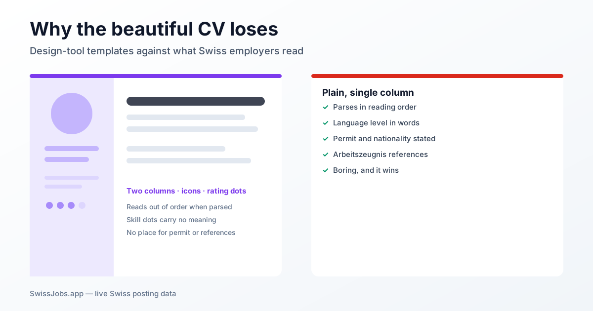
In short
Use a well-built grotesque — Arial, Helvetica, Tahoma or your system sans — and set it so the x-height is right, not the point size. There is no Swiss rule to follow: arbeit.swiss puts a number on the page count and says nothing at all about typefaces, in any of its four language versions. The Confederation prescribes Arial for its own business correspondence. What matters more than taste is whether the font can spell the names your CV contains.
This gets treated as a matter of taste and is not one. A CV is printed, read on screen and parsed by software, and in all three cases what decides is not elegance but build quality: whether the font holds every character that occurs in Swiss names, how large it appears at a given point size, and how much line length it consumes. All three are measurable — and the measurement contradicts the most common piece of advice on the subject.
The figures below come from two places: the font binaries installed on an ordinary machine, and the employer names and advert titles in the postings on SwissJobs.app. The names supply the demand for characters; the font files supply the character inventory, the x-height and the set width. The headline result: the familiar advice that a serif saves space holds only while you compare point sizes — and point size is not a quantity you can compare across two typefaces.
- No Swiss authority prescribes a typeface. The application guidance on arbeit.swiss, run by the State Secretariat for Economic Affairs, is the source almost every Swiss application tip traces back to. It puts a number on length — «A CV should be no longer than three pages» — and asks that the document «be complete, clear and not contain any gaps». On typefaces and font sizes it says nothing, in any of the four language versions. Anyone who quotes you a mandatory font is quoting nobody.
- The one federal text that does name typefaces names them as a hazard. The Federal Chancellery's writing instructions carry a section headed «confusable digits and letters». Margin note 267 reads: «In manchen Schriftarten (z. B. Times, Arial, Courier) können bestimmte Zeichen miteinander verwechselt werden» — in some typefaces certain characters can be confused with one another, digits, letters and units of measurement alike. Note 268 gives the classic case: lowercase l against the digit 1.
- For itself, the Confederation has settled the question. Its corporate design page states that the federal logo is set in Frutiger, that «In der Geschäftskorrespondenz und bei Präsentationen soll die Arial als Schriftart verwendet werden» — Arial is to be used for business correspondence and presentations — and that federal websites are to be built with the free typeface Noto Sans. Three fonts, three uses, and for the document closest to a CV, Arial.
- First test: can the font spell the names? 7.0 per cent of the distinct employer names in the postings on SwissJobs.app contain a Latin letter beyond plain ASCII. Twenty-six such letters are needed in total; the five most frequent are ü, é, ä, ö and è — two national languages in five characters. Of the widely installed fonts tested, only Gill Sans falls short, and it does so on 0.09 per cent of employer names.
- How often you meet the problem depends on the language you are applying in. Across all postings, 40.1 per cent carry a character beyond the plain alphabet in the employer name or the job title. Among French-language postings that rises to 66.8 per cent; German-language postings sit at 45.4 and English-language ones at only 11.7. If you arrived from an English-speaking market, the question has simply never come up before.
- Second test: a point size is not a size. What decides how large a font looks is its x-height relative to the em. Arial sits at 51.9 per cent, Helvetica at 52.3, Verdana and Tahoma at 54.5, Georgia at 48.1, Times New Roman at 44.7, Baskerville at 40.0, Cochin at 37.2. To look as large as 11-point Arial, Times New Roman needs 12.77 points, Georgia 11.87, Baskerville 14.27 and Cochin 15.35.
- Third test: what the font costs in space — and this is where the folklore inverts. At the same point size, Times New Roman does run 7.8 per cent narrower than Arial, which is why it has its reputation. Matched to the same apparent size, it runs 7.1 per cent wider. Baskerville then costs 20.8 per cent more line length, Courier New 58. Of the text faces tested, only Tahoma runs narrower than Arial without looking smaller, at 94.4.
Why no rule exists, and what replaces it
Switzerland puts an official number on how long a CV may be and none at all on how it should be set. That is not an oversight. An authority can specify length because length is checkable; specifying a typeface would tie every application to the software the applicant happens to own. So the guidance stops at an outcome: the CV must be complete and clearly laid out. Clarity is a result, not a font list.
Which is precisely why the question is answerable — just not with a name. A typeface that can carry your CV has to do three things. It has to hold every character that appears in the names of your employers, your schools and your own civil-status details. It has to look large enough at your chosen size to be read without effort on paper and on screen. And it must not consume more line length than two pages can absorb.
The single place in Swiss federal writing law where typefaces appear by name turns the question around in a useful way. The Federal Chancellery's writing instructions — binding for the Confederation's official texts, a recommendation for ordinary business correspondence — cite Times, Arial and Courier not as models but as examples of faces in which characters get confused. The criterion there is unambiguity, not beauty. For a CV that is the better criterion too: a date, a permit class and a telephone number have to be unmistakable at first glance.
Your CV has to spell names you did not choose
You do not control your own surname, and you control your former employers' names even less. That is where the holes appear. In the postings on SwissJobs.app, 7.0 per cent of distinct employer names contain at least one Latin letter beyond the plain alphabet. Twenty-six distinct characters are needed to cover them. The bulk is carried by ü, é, ä, ö and è, followed by ô, à, ç and â, and then a long tail of single cases from names of Latvian, Turkish, Spanish and Polish origin.
For a real text face that is a low bar — the common system fonts cover the whole demand. The exception is instructive. Gill Sans, regularly offered inside CV templates as the elegant alternative, lacks three of the required characters and therefore cannot set 0.09 per cent of employer names correctly. That sounds like nothing. For the person affected it is not a fraction of a per cent, it is the name of the company they worked at for five years, appearing in the print-out as an empty box or silently switching to a different typeface mid-word.
The odds of it mattering to you depend on the language region. Across all postings, 40.1 per cent have a character beyond the plain alphabet in the employer name or the title. In French-language postings it is 66.8 per cent, in German-language ones 45.4, in English-language ones 11.7. If you brought a template from an English-speaking market, the shortfall was invisible there and becomes visible here — which is also why arrivals are the group most likely to send a CV that renders wrong.
Eleven points means nothing on its own
A point size measures the em square, not the letters inside it. What determines apparent size is the x-height — the height of the lowercase x relative to that square. Measured from the font files: Arial 51.9 per cent, Helvetica 52.3, Verdana and Tahoma 54.5 each, Georgia 48.1, Times New Roman 44.7, Baskerville 40.0, Cochin 37.2.
Translated into working numbers: to appear as large as 11-point Arial, Times New Roman must be set at 12.77 points, Georgia at 11.87, Baskerville at 14.27 and Cochin at 15.35. In the other direction, Verdana and Tahoma only need 10.48. So changing the typeface while leaving the point size alone quietly changes how readable the whole document is — nearly always downwards, because the serif faces recommended as serious all have smaller x-heights than the grotesques they replace.
The practical method follows from that. Set one line of your CV in the candidate face next to the same line in 11-point Arial and adjust until the lowercase letters are the same height. Only then is it worth asking whether you like the font, and only then are the two documents comparable in length. Anything else compares two pages that share a number and nothing else.
The serif does not save space; it costs space
The most widely repeated piece of advice on this question is that Times New Roman or Garamond fits more on the page. Compared at the same point size, that is true: the same text runs 7.8 per cent narrower in Times New Roman than in Arial. It is also noticeably smaller, because its x-height is about a seventh lower.
Match the two for apparent size and the sign flips. Times New Roman then needs 7.1 per cent more line length than Arial, Georgia 8.6 per cent more, Verdana 8.1, Avenir 10.7, Baskerville 20.8, Didot 22.1, Cochin 33.9 and Courier New 58. Only one text face measured runs narrower than Arial without looking smaller: Tahoma, at 94.4. Verdana and Tahoma have identical x-heights, and Verdana still needs 14.5 per cent more room — the same idea drawn wide and drawn narrow.
On a two-page CV, an eight per cent difference in line length is roughly one line in twelve. That is the distance between a role that still fits on page two and a third page that opens with three orphaned lines. So if you are hunting for space, look at leading, at margins and at what you can cut — and if you do look at the typeface, look for a narrow grotesque, not for a serif.
Capitals, umlauts and the German ß
The most common typographic mistake on a Swiss CV is in the header: the applicant's own name in letter-spaced capitals, set in a face that was not drawn for it. The Federal Chancellery's writing instructions address the case directly. Margin note 265 requires that umlauts in capitals be written Ä, Ö and Ü rather than Ae, Oe, Ue. Note 266 adds the exception for proper names with a traditional spelling, and gives Aesch, Oerlikon and Uehlinger as examples.
Two things follow for a CV. If your surname is traditionally spelled with Ae, Oe or Ue, that spelling survives into capitals — the font must not normalise it. If it carries a real umlaut, the face has to hold capital Ä, Ö and Ü and keep the dots above the letter at display sizes instead of letting them collide with the line above. Tight leading plus capitals is exactly where that fails, and it fails only for the people whose names have umlauts.
The German ß does not belong in a Swiss document. How firmly that holds can be read off the source itself: across the roughly 144 pages of the Federal Chancellery's writing instructions the character does not occur once, while forms such as Strasse, gross and Fliesstext are used throughout. In the postings on SwissJobs.app a ß turns up somewhere in the text in 2.9 per cent of cases, essentially always arriving with German copy. If you built your CV from a German template, search for it before you send.
Numbers, the phone line, and the characters nobody sees
A good part of a CV is digits: years, workload percentages, a telephone number. The Chancellery's instructions govern how those are set, and concretely enough to follow. Margin note 512: digits are grouped in threes, a fixed space is used for the grouping, the older grouping with an apostrophe «sollte nicht mehr angewendet werden» — should no longer be used — and grouping with full stops or commas is incorrect.
For the telephone number in your header, note 519 is the answer: the dialling code is written with its leading zero, the code and the following three digits form blocks of three, and the remaining four digits form two blocks of two. Note 520 covers the international form — a plus sign with no space before the country code, and the leading zero of the local code dropped. Follow that and your header looks like a Swiss business letter, which in turn needs a font with evenly built digits and a clean fixed space: a text face, not a display face.
The quiet remainder is the characters you cannot see and send anyway. The employer names and job titles in the postings on SwissJobs.app hold 197 soft hyphens, along with no-break spaces, narrow no-break spaces and zero-width characters. On apostrophes, 517 straight typewriter marks stand against 115 typographic ones. And at least once a ligature has survived as a character in its own right — a single glyph standing for the two letters f and i, which a text search for «fi» will not find. Copy your CV together from other files and you inherit all of that; it survives the export to PDF and surfaces exactly where someone searches for a word.
The recommendation, briefly
Take a grotesque with a large x-height and a full character set: Arial, Helvetica, Tahoma, Noto Sans, or your machine's system sans. Set it so the lowercase letters stand as tall as they do at 11-point Arial, and buy air with leading rather than with point size. Use one family throughout and differentiate with weight and size, never with a second typeface.
Avoid what adds nothing: display faces, scripts, condensed cuts below the apparent size of 10-point Arial, and any font you have not personally tested with your own name and your last employer's name in it. Export as PDF so the font travels with the file. A typeface missing on the reader's machine gets substituted, and substitution changes set width and line breaks — which is how a checked two-page document arrives as an unchecked three-page one.
The default draft in the CV builder on SwissJobs.app follows exactly this arithmetic: a neutral grotesque with a system fallback, body text at 13 pixels on an A4 page laid out at 96 pixels per inch, and a line height of 1.65. That is a modest size with generous air — the combination that carries the most content across two pages without looking smaller. If you pick your own typeface, check it against that arithmetic rather than against how it looks on your screen.
The market figures were counted on 22 August 2026 from the postings then live on SwissJobs.app. The character demand is derived from the distinct employer names and the advert titles; «beyond the plain alphabet» means any Latin-script letter above the ASCII range. Language shares rest on the language detected in the posting; postings with no detected language are included in the overall figure but in none of the per-language ones. The typographic values were read directly from the font binaries installed on an ordinary Mac: x-height and cap height from the metrics table, set width as the sum of advance widths over a sample of 400 employer names and 400 advert titles. Kerning and ligature substitution are not taken into account; that moves every font in the same direction and does not change the ranking. Fonts not installed on the machine — among them Calibri, Cambria and Garamond — could not be measured and are therefore absent. The requirements on the application dossier come from the four language versions of the arbeit.swiss (SECO) application tips, the writing rules from the Federal Chancellery's writing instructions, and the statements on Frutiger, Arial and Noto Sans from the Federal Chancellery's corporate design page.
One column or two on a Swiss CV?
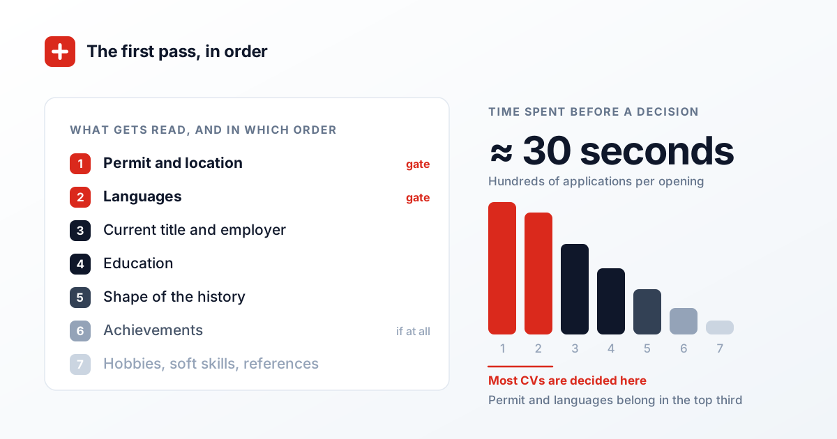
In short
Both work. No Swiss official source has an opinion on columns: the federal application-tips page asks for a CV that is complete, clear and free of gaps, structured chronologically with the most recent job first, and sent as a PDF. Nothing about layout. We built the same CV seven ways, printed each to PDF and read the text back with a plain extractor. The column count never broke the reading order. One construction did.
That matters because the advice you will have read says the opposite. The claim that a two-column CV comes out scrambled is repeated everywhere and almost never tested. In all seven builds — single column, grid with the narrow column on the right, grid with it on the left, a build that looks left-hand but sits last in the source, newspaper columns, absolutely positioned blocks, and a classic table — the positions came out in the correct order, each date still attached to its title and employer. Nothing was scrambled. Several things moved.
What moved was the short-facts block, and it moved with the source order rather than with the visual side. Main content first in the file: the name is the first thing a machine reads. Narrow column first in the file: fourteen lines and 181 characters go by before the name appears. And in the table build — one row, a short block on the left, a slice of career on the right — the permit and references landed between the 2015–2018 position and the 2012–2015 one. That is the build hiding inside most Word templates sold as two-column.
- There is no Swiss rule on columns. The application tips published by the State Secretariat for Economic Affairs list eight content blocks, cap the CV at three pages, require reverse-chronological order and ask for a PDF. In all four language versions there is not one word about how the page is arranged. The closest any version comes is the German word «übersichtlich» — easy to take in at a glance.
- Column count does not break a machine read; construction does. Seven builds of the same CV, each printed to PDF and read back with an ordinary text extractor: in all seven the chronology came out in order, and in all seven every date stayed next to its title and employer.
- Reading order follows the source, not the page. One build placed the narrow column visually on the left while leaving it last in the file — and the extracted text still started with the candidate's name. What the eye meets first and what a parser meets first are two separate settings, and a designed template can set them against each other without telling you.
- The one build that genuinely interleaves is the two-cell table row — the Word classic. There the permit and references blocks were extracted between two jobs, and ten lines ran before the name. It is not the two columns doing that; it is the table alternating left and right, row by row.
- Two columns buy measurable space, and the amount depends on how much sits beside the career. Same content, same type size, A4 with 16 mm side margins: nine positions plus four short blocks need 309.3 mm of vertical extent in one column — two pages — against 258.2 mm in two, which is one page. That is 16.5 per cent. With twelve short blocks it is 45.1 per cent.
- The saving stops the moment the narrow column is taller than the wide one. In the same series it flips at fourteen short blocks: the two-column build then needs two pages as well, and the second column has saved nothing. It is free space only while it stays shorter than the career beside it.
- A narrow column is a bad place for a German job title. In adverts on SwissJobs.app, 17.2 per cent of German-language postings carry a title word of 18 characters or more and 9.6 per cent one of 20 or more, against 0.4 per cent of English-language postings, 0.1 per cent of French and none in Italian. Measured at 10 pt, «Instandhaltungsmechaniker» is 43.1 mm wide; a 55 mm column has about 47 mm of text width.
One-column or two-column CV
| Criterion | One column | Two columns |
|---|---|---|
| Parsing risk | none | low to moderate; check the order |
| Use of space | worse | clearly better |
| With a lot of content | runs to three pages fast | holds two pages |
| With a short career | looks more complete | looks empty |
| Language levels, workload, permit | buried in running text | readable in a side column |
| If you cannot test the export | the safer choice | only with a clean export |
Two columns are not an ATS mistake — measured, the parsing risk is low to moderate, and the real risks are headers, text boxes and icons. The choice is about how much information you have, not about technology.
What the official page actually requires
Switzerland has an official number for pages and none for columns. The same arbeit.swiss page that caps a CV at three pages says nothing about arrangement. It asks for three things that touch on form: the CV should be complete, clear and free of gaps; it should be structured chronologically with the most recent job first; and everything should be sent as PDF. It also lists what the document must contain, in a given order, from the title down to references.
Of those, the chronology requirement is the one that constrains a layout. It describes a single sequence. A two-column CV must not split that sequence — the career belongs entirely in one column. The moment 2022 to 2016 sits on the left and 2015 to 2009 on the right, you have two chronologies and the reader has to work out which one starts. That is the mistake worth avoiding, and it is a different mistake from having two columns at all.
It is also worth knowing what the page does not do: it never mentions applicant tracking software, keyword matching or machine readability. The Swiss framing is a document that a person reads and that a set of reference letters later confirms. Advice built on American screening tools imports a problem the official source does not describe — which is precisely why it is worth measuring rather than repeating.
The test: one CV, seven builds
The warning that two columns get read out of order is stated far more often than it is checked, so we checked it. The same sample CV — name, contact line, five or nine positions, education, plus languages, software, permit and references — was set in seven different constructions, exported to PDF through a browser's print dialogue, and read back with a plain text extractor. No AI model was involved. What was measured is the text layer of the PDF: the order in which the characters are stored, which is what any automatic reader starts from.
Finding one: in all seven builds the positions came out in the right chronological order, and in none of them was a date separated from its job title or employer. That held for the grid with a right-hand column, for newspaper columns, for absolutely positioned blocks and for the table. The blanket claim that two columns destroy parsing does not survive the test in that form.
Finding two: what changes is where the short-facts block lands, and that follows source order only. Main content first in the document and the read begins with the name — character zero. Narrow column first and languages, software, permit and references come first, with the name arriving after fourteen lines and 181 characters. The two pages look identical on paper. If your name and current title matter in the first seconds of an automatic summary, that difference is the one to control.
Finding three, and the real warning: in the table build, where each table row carries a short block on the left and a slice of career on the right, the permit and references blocks were extracted in the middle of the work history — between the 2015–2018 entry and the 2012–2015 one — and ten lines ran before the name. Many downloadable templates are built exactly this way. The fix is not to abandon two columns; it is to abandon the table.
What the second column is really worth
The honest reason to use two columns is space, and in Switzerland space is a bounded resource because three pages is the published ceiling. So that was measured too: identical content, 10.5 pt body text, A4 with 16 mm side margins and 18 mm top and bottom, giving a printable area of 178 by 261 mm, with a 55 mm narrow column and a 6 mm gutter.
With nine positions and two short blocks beside them, the two-column build is 4.1 per cent shorter. With four short blocks — languages, software, permit, references, the usual set — it is 16.5 per cent: 309.3 mm against 258.2 mm, which is the difference between two pages and one. With six blocks it is 26.1 per cent, with eight 33.7, with twelve 45.1. The saving grows with the non-chronological material, because in one column that material consumes full-width lines while in two it moves into a column that would otherwise be empty.
And it ends when the narrow column outgrows the wide one. At fourteen short blocks both builds need two pages. The second column is free space only while it stays shorter than the career next to it — so if you are reaching for two columns to save a page, do the arithmetic instead of hoping. The useful question is not whether two columns look better; it is which of your two columns is the tall one.
The narrow column has less to carry than templates assume
Before building a sidebar, it is worth asking what actually goes in it. The answer is smaller than the templates suggest. Among adverts on SwissJobs.app that carry a short description, 16.9 per cent name a formal qualification, 11.6 per cent a language, 8.4 per cent a named piece of software and 2.1 per cent a driving licence. At least one of those short facts appears in 34.4 per cent, two or more in only 5.1 per cent and three or more in 0.4 per cent.
That is not an argument for leaving languages or permit out — both are checked early in Switzerland whether or not the advert spells them out, and for anyone applying from abroad the permit line is the first thing a screener looks for. It is an argument against filling the column. Four real blocks — languages, software, permit, references — come to 69.3 mm of height, which is 26.6 per cent of the printable page. Three quarters of the column stays empty.
That emptiness is why so many two-column CVs end up with skill bars, stars and percentage rings. The rating dot is rarely a decision about content; it is a decision about a hole in the layout. Narrowing the column to 45 mm, or letting it stop halfway and giving the rest of the width back to the career, solves the same problem without inventing a single claim about yourself.
Page two loses the column
One effect only shows up when the document runs long: when a two-column layout grows past one page, the narrow column does not come with it. In a test with twelve positions and eight short blocks, the entire contents of the narrow column stayed on page one; page two carried only the last two positions, full width, with no column and no coloured band. The two pages read as if they came from different documents.
Page one takes the opposite damage. Because the short blocks end long before the career beside them does, several centimetres of the narrow column sit empty at the bottom — and if the column has a coloured background, the colour keeps going while the content has stopped. It is the most common visible flaw in a designed CV that ran one job longer than the template expected.
So the two-column build is mainly a one-page solution, and for an application that needs two pages anyway it is the harder road. If you do go two pages, restart the narrow column on page two with its own short heading rather than letting it trail off. That is how the default layout in the SwissJobs.app CV editor is built: a wide column for the history, a narrow one taking 28 per cent of the page width, placed after the main content in the document, and started fresh on every page.
The rule, and a five-minute check
First: choose two columns when you have enough short facts to fill a narrow column and doing so saves you a page — otherwise one column is the quieter choice and it costs you nothing. Second: the whole career goes in the wide column, as one chronology, most recent first. Third: build the page with a grid or with text frames, never with a table whose rows alternate left and right.
The check takes five minutes and tells you more than any template description. Save the CV as PDF, open it, select all the text with the keyboard, paste it into an empty text document and read what you get. If the positions appear in order and your name is near the top, the layout is fine no matter how many columns it has. If your permit turns up between two jobs, you are looking at the table build and it needs replacing.
One last thing that measurement cannot settle. Perception is a fact of the market too: in parts of German-speaking Switzerland a visibly designed CV reads as unserious, and columns are the most visible design decision there is. Two columns of plain text with clear headings do not trigger that. Two columns with a colour panel, star ratings and doughnut charts do — and for those, the objection is not the machine, it is the reader.
What people report
Among the Swiss CV posts collected for the SwissJobs.app CV guide, two speak about columns directly. Both file them alongside colour blocks and rating bars, both advise against them, and both justify it with automated screening. Our own test does not support that justification — column count alone never broke the reading order in any build. The advice is not wrong about how a designed CV is received; it is wrong about the mechanism.
A count of the Swiss CV posts collected for the SwissJobs.app CV guide; the two carrying a statement about columns were read by hand and summarised rather than quoted.
The same collection carries a recurring observation from people who moved to Switzerland: language skills are not treated the way they are in the UK or the US, as a line at the bottom, but as one of the first things checked against the advert. That fits what the layout test implies — whatever a screener looks for first belongs in the top third of the page, and which of the two columns holds it matters far less than how high up it sits.
The same collection of Swiss CV posts; first-hand accounts from applicants, not an analysis of rejections.
The layout measurements were made on 22 August 2026 specifically for this answer. The same sample CV was set in seven constructions, exported to PDF through a browser's print dialogue and read back with an ordinary text extractor; no AI model was involved. What was measured is the text layer of the PDF — the order in which characters are stored — and not the behaviour of any particular recruiting system, which may apply further rules of its own. Height figures assume A4 with 16 mm side margins and 18 mm top and bottom, body text at 10.5 pt, a 55 mm narrow column and a 6 mm gutter; percentages are differences in the total vertical extent of identical content. Word widths were measured at 10 pt and 11 pt Helvetica. Market figures come from the adverts live on SwissJobs.app on 22 August 2026. Title word lengths use the longest unbroken run of letters in the job title together with the detected language of the advert; adverts with no detected language are not shown. The shares for qualification, language, software and driving licence cover adverts for which a short description exists — 74 per cent of the index — and measure explicit mention in that short description, not the full requirement list of the advert. The CV requirements come from the four language versions of the arbeit.swiss (SECO) application tips.
Sources
- arbeit.swiss (SECO) — application tips: a CV should «be complete, clear and not contain any gaps» and «be structured chronologically, with your most recent job mentioned first»
- arbeit.swiss (SECO) — the same page in German: «Er muss vollständig und übersichtlich gestaltet sein»
- arbeit.swiss (SECO) — the same page in French: «Il doit être complet, clair et soigné»
- arbeit.swiss (SECO) — the same page in Italian: «Il curriculum vitae non deve superare le tre pagine.»
- berufsberatung.ch — the three parts of a Swiss application file, with no rule on arrangement
- Federal Chancellery — Schreibweisungen, margin notes 265–268 (umlauts, confusable digits and letters) and 512–520 (grouping of digits, telephone numbers)
- Federal Chancellery — corporate design fundamentals: Frutiger for the logo, Arial for business correspondence, Noto Sans for websites
Related questions
What our job index says about the Swiss market
Computed live from our own index, not quoted from a study. Shares only, as of today.
Language the advert is written in
- Deutsch
- 60%
- English
- 23%
- Français
- 13%
- Italiano
- 3%
Of adverts that state a language requirement, the share asking for
- Deutsch
- 70%
- English
- 43%
- Français
- 21%
- Italiano
- 3%
19% posted in the last 7 days · Largest markets: Zürich 18% · Bern 10% · Genève 5% · Basel 5%